How communication theory works in the field of digital design
Throughout the course, communication is described not as the transmission of information, but as a process of meaning creation that unfolds through interaction, symbols and context. This perspective allows us to look at design as a communicative system rather than a neutral interface.
In digital products, interfaces actively participate in communication. Visual hierarchy, colour, rhythm and interaction cues guide interpretation and shape behaviour before any explicit explanation appears. Design elements work as signs that users read intuitively, relying on cultural experience and everyday practices.
The course also highlights that communication is always contextual and embedded in social routines. Digital interfaces structure what actions feel possible, appropriate or natural, influencing how users make decisions and how confident they feel in them. In this sense, affordances are not only technical, but also social and cultural.
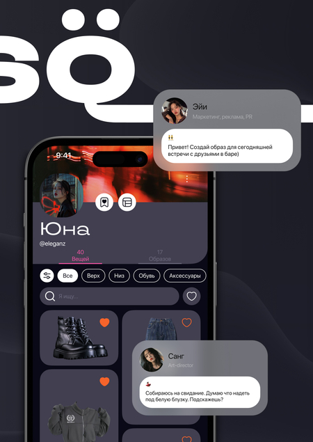
This understanding is especially relevant for products related to self-presentation and everyday choice. By organising options and visual narratives, design participates in constructing identity and meaning. The StylёQ project builds on this approach, treating a virtual wardrobe and an AI stylist as a communicative environment that mediates decision-making, self-expression and daily interaction with clothing.
Presentation of StylёQ for a general audience
StylёQ — your virtual wardrobe with an AI stylist

StylёQ is a digital wardrobe that helps people organise their clothes, create outfits and make everyday style decisions with confidence. Powered by an AI stylist, the app turns choosing what to wear into a simple, intuitive and personalised process.
StylёQ is designed to support daily routines rather than complicate them. Instead of endless scrolling, doubt and overthinking, the app offers clarity, structure and a sense of ease in everyday interaction with clothing.
Everyday choices, without stress
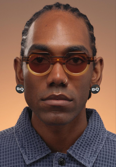

For many people, getting dressed is not about fashion trends, but about everyday decision-making. What fits the weather? What works together? What feels right today?
StylёQ responds to these everyday questions by organising clothing into a clear visual system. The interface suggests combinations, adapts to context and gently guides choice, reducing cognitive load and decision fatigue. Through this interaction, the app communicates reassurance and support rather than pressure or judgment.
By framing style as an ongoing dialogue rather than a one-time decision, StylёQ helps users feel more confident and comfortable in their daily routines.
Why StylёQ works
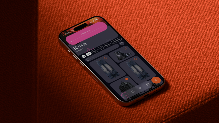
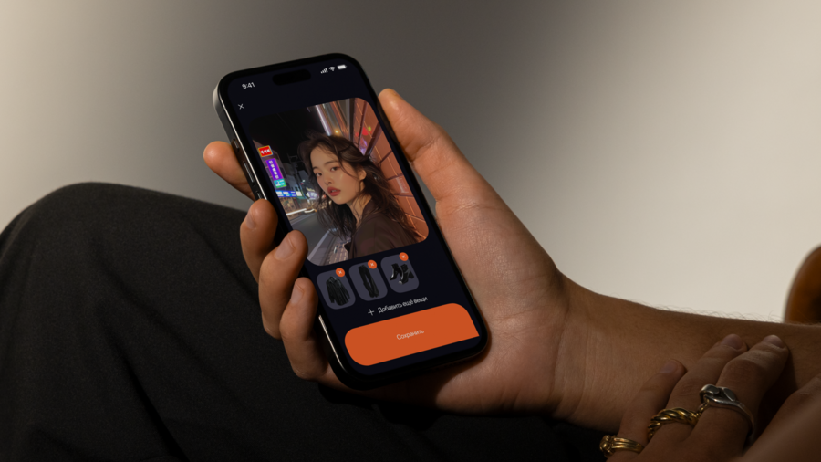
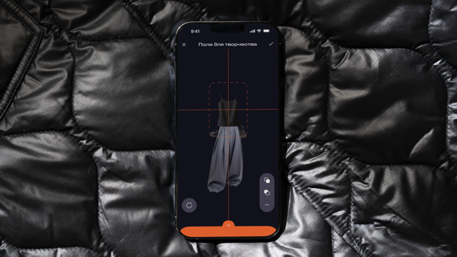
StylёQ is built around a few simple ideas:
— An AI stylist by your side StylёQ works as a personal assistant that helps you combine clothes, discover new outfits and see your wardrobe from a fresh perspective.
— Everything in one place Your wardrobe, outfits, ideas and plans are gathered in a single system, making everyday choices faster and more coherent.
— Freedom to experiment StylёQ encourages trying, mixing and changing without fear of making mistakes. You can explore different moods, styles and combinations at your own pace.
Express yourself!
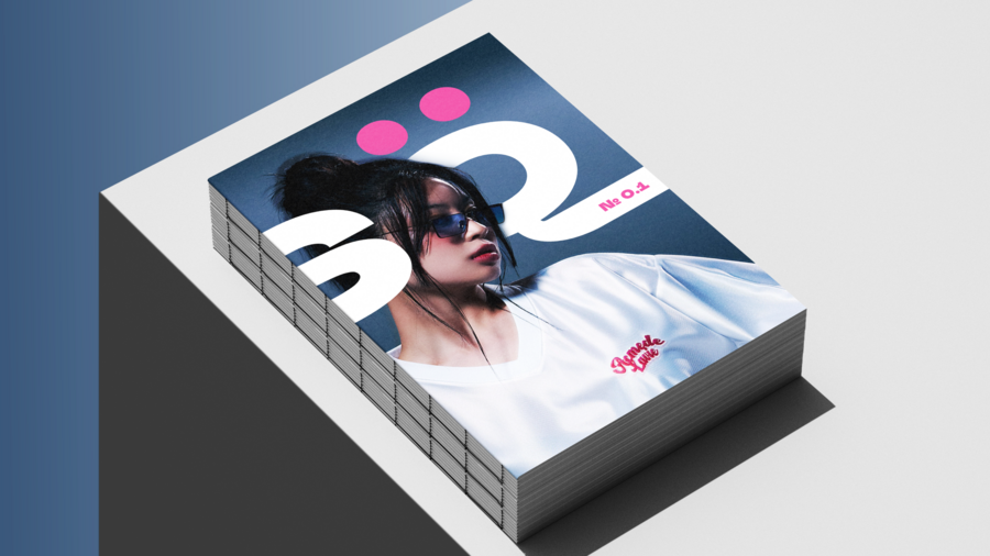
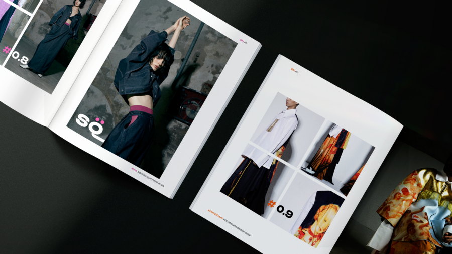
Style is a form of self-expression, and it doesn’t have to be intimidating. StylёQ encourages you to explore, mix, rethink and play with your clothes.
There are no «wrong» choices here — only personal ones. StylёQ is there to support your confidence, help you trust your taste and enjoy the process.
Don’t be afraid to express yourself. We’re here to help you do it your way.
Presentation of StylёQ for a professional audience
Brand concept and visual identity
StylёQ is built around the idea of confident self-expression. The brand’s visual language encourages users to be bold, visible and unafraid of standing out. It avoids neutral or muted aesthetics and instead embraces contrast, energy and emotional clarity.
The identity is designed to support experimentation and individuality, reflecting the idea that personal style is not about fitting in, but about expressing oneself freely.
Colour system
The core colour palette is based on bright accent tones, primarily pink and orange. These colours are used deliberately to create a sense of energy, confidence and emotional openness.
Pink works as a signal of freedom and self-acceptance, while orange adds movement, warmth and dynamism. Together, they form a visual atmosphere that feels expressive rather than restrained, inviting users to engage with the product without fear of being «too much».
Neutral tones are used as a background to let accent colours remain impactful and to maintain visual balance.
Typography
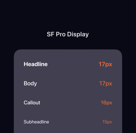
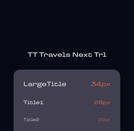
StylёQ’s typographic system combines expressiveness and clarity.
— TT Travels Next is used as an accent typeface. Its character and presence reinforce the brand’s confident and slightly daring tone, making headlines feel bold and intentional.
— SF Pro Display functions as the primary body typeface, ensuring readability and familiarity within a digital interface.
This combination allows the brand to remain visually distinctive while maintaining usability and comfort in everyday interaction.
Visual tone and style
The overall visual style is designed to feel supportive rather than restrictive. Bright accents, clear layouts and confident typography work together to lower the emotional barrier to experimentation.
StylёQ avoids rigid visual rules and instead creates a flexible system that adapts to different moods, styles and personal preferences. The brand does not dictate how users should look — it creates a space where different expressions feel equally valid.
Brand as an invitation



