
Communication theory in design
There are more than 200 definitions of communication, but most often It is defined as a relational process, systematic process or as the process of generating meaning by sending and receiving various signs.
Communication theory in design explores the systematic analysis of how information and meaning are conveyed through visual elements. It examines design not only as visual aesthetic but as intentional transmitters of encoded messages from creators to consumers. The designer assumes the role of an sender who strategically embeds specific objectives—informative, persuasive, emotional—or even ideological narratives into the design using various formal attributes such as shapes, colors, typography, patterns, layout or texture.
Consumers act as receivers who decode these visual signals based on their individual cultural background, personal experiences, and cognitive frameworks. That’s when one significant challenge arises: A potential mismatch between the designer’s intended message and its reception by the audience may lead to failure of a product or advertising campaign. That’s why effective communication requires empathy toward varied interpretive lenses.
Thus, communication theory provides designers with essential tools to construct deliberate narratives. Through thoughtful selection and combination of visual components, they actively mold perceptions, create meaningful associations, and motivate audiences. Beyond aesthetics, design becomes a vehicle for storytelling and shaping group consciousness.
Armed with the knowledge of how communication works, designers can deliberately engineer visual strategies that enhance clarity, engage viewers, and foster deeper connections. Hence,
it is necessary because it allows professionals to make elaborate decisions.
Presentation for a general audience

«Op-Shlep» is a design brand of beach shoes with a fun sole that leaves unique marks.
Positing:
We’re a flip-flops brand for people who want to stand out and…just have fun! For the bright and cheerful, because every single footprint we make leaves unique marks and smiling l faces, so that people can recognize our brand by the marks in the sand.
Slogan:
«Flop through life smiling»
Target audience
We create shoes not just for walking, but for expressing mood and play. Our target audience is people who see leisure as an opportunity for self-expression, a little mischief, and the creation of unforgettable moments.
Ages 16-35
16-23 years old (Generation Z): Students, high school students. They seek self-expression, are active on social media, and value uniqueness and interesting trends.
23-35 years old: Young people who have children for whom they are ready to buy funny shoes. They value a balance between work and play and enjoy funny quirks and jokes. Gender: 70% women, 30% men.
Women are more receptive to accessories, details, and the aesthetics of social media. Men respond to humor, originality, and a unique twist.
Geography and lifestyle: Residents of large and medium-sized cities with a fast pace of life, for whom recreation by the water is a valuable outlet and a way to recharge.
Residents of coastal towns and resorts (permanent or seasonal). Active travelers who plan annual trips to the sea (in Russia or abroad).
Presentation for a professional audience
Brand main features.
Category: mid-to-upper price segment flip-flops.
Target audience: young-adult people, parents. People who want to express their emotions through routine things.
Ideology: «Op-Shlep» is a brand that offers a simple way to stand out with everyday items, the advertisement should fit for both children and adults.
Logo
Semiotic Tradition
At its core, «Op-Shlep» functions as a system of playful signs. Every visual and tactile element is a signifier loaded with connotative potential: The smiling stain (replacing the letter «E») is not merely decorative—it signifies joy in imperfection, creative spontaneity, and human warmth. Bright, saturated colors act as signs of optimism and accessibility. Footprint motifs transform a mundane object (the slipper) into a symbol of presence, trace, and expression. Crucially, we avoid overdetermined denotation. The stain is more than just a letter —it’s open to interpretation and replacement. We prefer to accent on footprint instead of slippers or unusual design. The trace you make is more important than the shoes you wear.Color palette
Color = optimism (pink, purple, yellow) Form = simplicity + warmth (rounded edges, smiling faces) Atmosphere = Bright and shining moment. Sun, sand, sea and unique traces.
We use mascots in posters and advertising — children who always wear flip-flops and are always happy. They are needed so that the potential audience can associate themselves with them, and also to convey the necessary information in a cheerful manner.
Rhetorical Traditions (Emotional Engagement)
Our public-facing campaigns leverage pathos such as humor, whimsy, surprise. Critically, we adhere to politeness theory by eliminating Face-Threatening Acts (FTAs): Emotions over rationalism. Our slogans must involve witty phrases with brand name or our product description (for example there is only one Flop to happiness). Freedom over criticism. Advertising should focus on emotional independence and freedom of expressions instead of separating the audience. «Op-Shlep» practices positive politeness at scale: affirming the user’s right to joy, rest, and creative messiness. Our tone is consistently inclusive, warm, and non-judgmental—a rare stance in a market saturated.
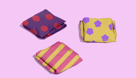
By combining visual play, emotional rhetoric, and a sense of social belonging, «Op-Shlep» aims to demonstrate how design can focus on both free will and emotional generosity, proving that sometimes the deepest communication begins with a simple «flop»
Communication theory as the basis of the project
To effectively engage with audiences while crafting a distinctive brand identity, «Op-Shlep» communication strategy was developed based on various aspects of communication theory. First of all our brand’s policy is grounded in some of the established communicative traditions proposed by Robert T. Craig:
-Semiotic Tradition
Leveraging semiotics, we implement the power of symbols and signs. Each element of our products carries meaning and triggers specific associations in consumers’ minds. Bright colors, funny prints on the soles and footprints on their own contribute to forming a positive image. This visual language conveys an aura of insouciance and optimism, transforming the act of purchasing into something more than just acquiring goods.
-Rhetorical Tradition
Employing rhetoric, we design communication messages intended to provoke strong emotional responses from our audience. Humorous and witty slogans, along with engaging advertisements, form an integral part of «Op-Shlep» Their purpose is to spark smiles and enhance viewer mood, fostering long-lasting positive emotional connections with the brand.



