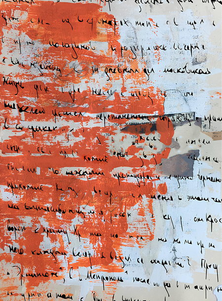
How communication theory works in the field of design

In contemporary design, communication is understood not as an supplementary tool of visual expression, but as a key process of meaning-making and interpretation. Design functions as a medium through which individuals interact with cultural, social, and material environments. Within communication theory, meaning is not transmitted in a finished form and does not exist independently of perception; rather, it emerges in the moment of interaction between the subject and a visual, spatial, or material object. Thus, design ceases to function as a carrier of a fixed message and instead becomes a space in which experience and interpretation take place.
The interpretative approach to communication emphasizes the active role of the recipient, for whom meaning is always dependent on context, personal experience, and cultural codes. In design, this implies a rejection of universal and unambiguous statements in favor of creating a framework within which the user participates in the construction of meaning. Objects and spaces do not impose interpretation but instead offer the possibility of experience and reflection.
From the perspective of the sociocultural tradition, communication is understood as a process through which social reality is reproduced. Values, norms, and collective memory are conveyed through visual forms, material objects, and practices of interaction. In this context, design does not merely reflect culture but actively shapes it by creating conditions for social connection and the emergence of communities. Brands and spaces function as communicative environments in which identity and a sense of belonging are formed.
The semiotic approach allows design to be understood as a system of signs, where meaning is produced not only through form but also through material, texture, and traces of time. Wear, imperfection, and fragmentation function as carriers of information, pointing to the history of an object and human presence. Materiality becomes a crucial element of communication, operating at the level of sensory perception and memory.
The phenomenological tradition further develops this understanding by shifting the focus toward subjective and embodied experience. Communication occurs through lived experience, incorporating tactility, spatiality, scale, and rhythm. In this case, design does not address rational decoding of a message but instead facilitates the formation of an emotional and personal connection between the individual and the object.
Taken together, these approaches frame design as a communicative process oriented toward interaction, interpretation, and participation. Meaning in design is not fixed; it evolves over time and is formed through human experience, providing the theoretical foundation for further examination of design practices.
Within this project, these theoretical principles of communication are examined through the example of the brand «Sbornik». For «Sbornik», design becomes a way of working with memory and experience — not through direct statements, but through a system of visual, material, and spatial signs. The choice of textures, restored objects, traces of time, and visual restraint forms a symbolic language through which the value of preserving the past and its sensory dimension is communicated. The project’s communication logic is grounded in an interpretative approach that assumes the active participation of the visitor in meaning-making; in a sociocultural perspective, in which the space of «Sbornik» functions as an environment for connection and the formation of community; and in semiotic and phenomenological perspectives that treat materiality, tactility, and experiential interaction as key elements of communication.
In the following sections, «Sbornik» will be analyzed as an example of how communication theory can be applied in practice to the development of a design strategy and a brand’s visual language.
Presentation for general audience
SBORNIK — FOR THOSE WHO LIVE INSIDE BOOKS
The «Sbornik» brand builds its communication with a general audience through a visual and material language that addresses experience, memory, and association rather than rational explanation. The project’s visual identity constructs a recognizable field of meanings in which book restoration is presented not as a technical service, but as a cultural and human practice of care, preservation, and connection. The brand’s communication is centered on the idea of attentive engagement with the past, expressed through visual metaphors, material traces, and a tactile aesthetic.
posters for «Sbornik»
A key element of the visual identity is the emphasis on texture and traces of time. Graphic elements resembling hand-made marks, imprints, deformations, and irregularities refer to the physical nature of the book and the process of its restoration. In posters and printed materials, these forms are perceived as visual traces of touch and intervention, highlighting the manual and intimate character of Sbornik’s work. This visual strategy makes the restoration process visible and emotionally legible without the need for direct explanation.
bookmarks for «Sbornik»
Typographic and compositional decisions support this logic. Enlarged letter fragments, punctuation marks, and textual quotations removed from linear narrative function as independent visual objects. They reference the book not as a vehicle of information, but as a carrier of memory and cultural experience. Repetition, rhythm, and modularity within poster series evoke the logic of a collection or archive, where each element operates as part of a larger whole, similar to individual books within a library.
posters for «Sbornik»
Color and contrast play a significant role in shaping the emotional perception of the identity. The use of saturated colors alongside neutral, paper-like tones creates a balance between a contemporary visual language and a sense of material presence. Color does not illustrate content directly, but functions as a tool for attention and emotional engagement, allowing the brand to remain visible in the urban environment while maintaining a restrained and respectful tone.
outdoor advertising for «Sbornik»
Outdoor and ambient media is particularly important in communication with a broad audience. Posters placed in the city operate as invitations to interaction rather than as promotional messages. Their visual language does not impose information but encourages pause, observation, and reflection. Window displays and interior applications extend this logic, forming an open environment in which books and people enter into dialogue. The presence of human figures within visual scenarios emphasizes «Sbornik» as a living space integrated into everyday urban life.
The brand’s communication is also shaped by its event-based format, including lectures, workshops, meetings, and book exchanges. The identity of these events maintains a consistent visual language while adapting to specific themes, allowing the brand to remain coherent yet flexible. The serial nature of posters and the variability of graphic solutions reinforce the idea of community and collective participation, where each individual becomes part of a shared process.
booklet for «Sbornik»
Thus, the presentation of the «Sbornik» brand to a general audience is grounded in an interpretative model of communication, in which visual identity does not explicitly explain values but creates a space for personal experience and meaning-making. The identity functions as a medium that connects the materiality of the book, cultural memory, and the contemporary visual environment, forming a recognizable and emotionally resonant brand image that remains open to dialogue and participation.
Presentation for professional audience
For professionals, Sbornik functions less as a brand and more as an open design platform for research, collaboration, and cultural production.
«Sbornik» is conceived as a design system in which visual, material, and communicative decisions are guided by a unified concept of preserving and transmitting cultural memory. For professional designers, «Sbornik» is of interest not only as a brand, but as an open platform that brings together research into form, materiality, and meaning.
corporate identity for «Sbornik»
The project’s color palette is based on principles of restraint and respect for the source material. The visual language relies on neutral and subdued tones — black, white, grey, and muted natural colors associated with paper, textiles, and wood. Accent colors are introduced sparingly and always functionally, marking events, processes, or interactions without disrupting the overall sense of calm and intimacy. This palette allows the visual identity to support, rather than compete with, objects, enhancing the perception of texture, traces of time, and handcrafted work.



